COLLECTION HERO SCENE
One styled space. Every product. A full brand story.
Jan 23, 2025
The brief: bring everything together — without losing the feeling
When a furniture brand approached me ahead of their website relaunch, their request was ambitious:
Can we show our entire collection — sofa, dining, accent pieces — in one image that feels lived-in, elegant, and cohesive?
They didn’t want isolated packshots or showroom-style photos. They wanted a hero image that would anchor their digital identity and express the brand’s essence in a single glance.
The challenge was to create something that felt like a real space — a home — but with enough clarity and structure to showcase each piece without clutter or distraction.
The concept: a space that breathes, a scene that sells
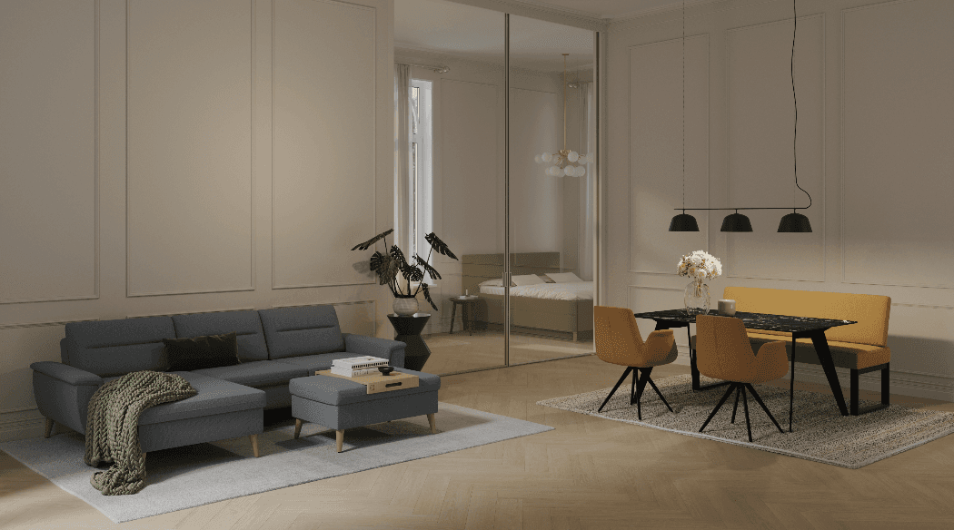
I designed a full interior layout that balanced zones of use (lounging, dining, accents) while letting each product group shine naturally.
The styling was curated to guide the eye without overwhelming it:
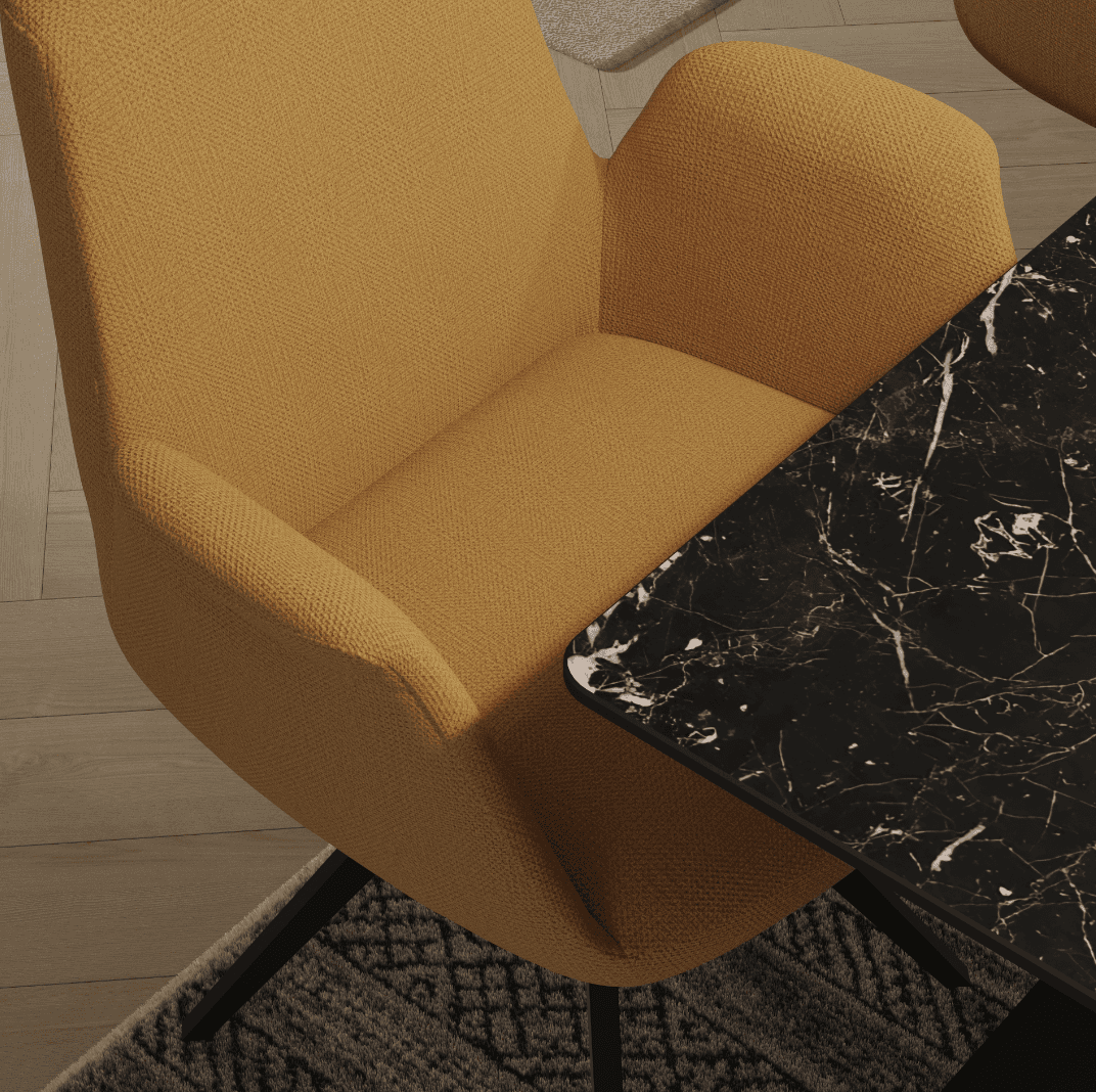
A mustard-toned sofa against soft neutral walls created a warm focal point
Forest green chairs introduced depth and contrast
Black marble accents added grounding and richness
Soft oak finishes tied everything together with calm continuity
Nothing felt staged. The composition was open, balanced, and emotionally inviting — like a room you’d want to step into and stay.
From a single shot to a whole ecosystem
While the brief was for one image, the strategy was much bigger. I designed the scene so that close-ups and detail crops could be pulled from it — turning one space into a full ecosystem of brand content.
From the overall layout to the grain of the wood and the texture of the upholstery, every detail was captured with intention. These assets were then used across:
Website banners
Product pages
Social content
Print catalogues
Showroom visual displays
And because the styling was consistent across wide and close-up shots, the brand’s aesthetic felt unified and premium throughout every touchpoint.
Why it worked
This project is proof that sometimes one great image can do the work of twenty.
By designing a scene that tells a story — not just shows a product — we gave the brand something stronger than content: we gave them clarity.
Clarity of style. Clarity of mood. Clarity of message.
Because when your collection lives in one space, your brand becomes one voice.